Case study
Big Squeeze Organic Juice Brand Identity
Designer: Jake ButricaInstructor: Paul Sheriff
Components
Brand identity | Package Design | TypographyDescription
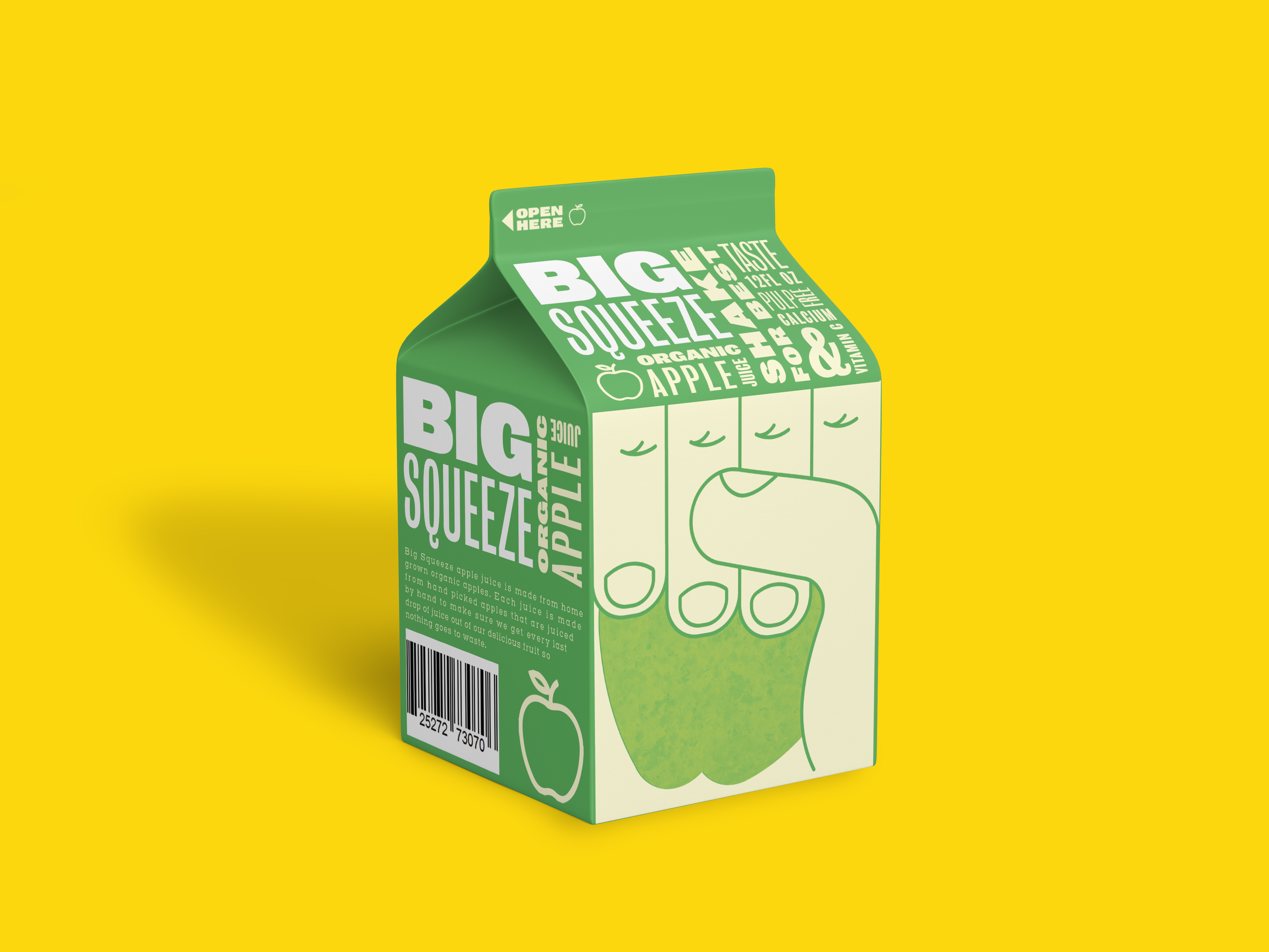
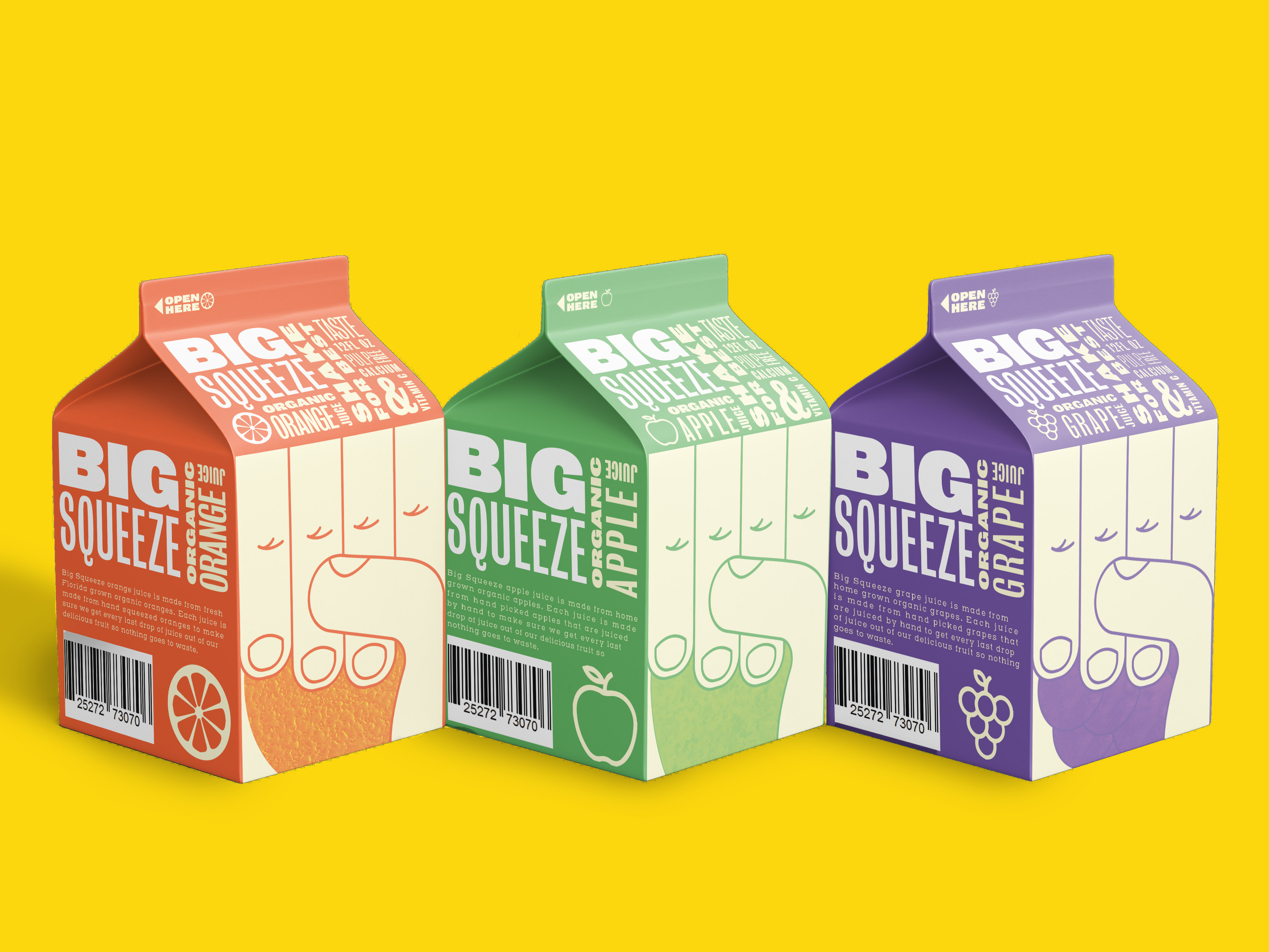
Big Squeeze Organic Juice is a packaging project that includes three seprate types of juices. The flavors are orange, apple, and grape and they come in a 12 oz mini juice carton The cartons are color cordinated and feature an illustration of a hand squeezing what ever fruit the juice flavor is. Accompanying the illustration on the front is a typographic arrangement of information about the juice in various weights of the font, Bureau Grot. The adjacent sides feature the logo, a brief statement about the juice and thier jucing proccess, a bar code, and an icon of a fruit. On the other side is the nutrition label.