Case study
KANGA Brand Identity
Designer: Jake ButricaInstructor: Paul Sheriff
Components
Brand identity | Package Design | TypographyDescription
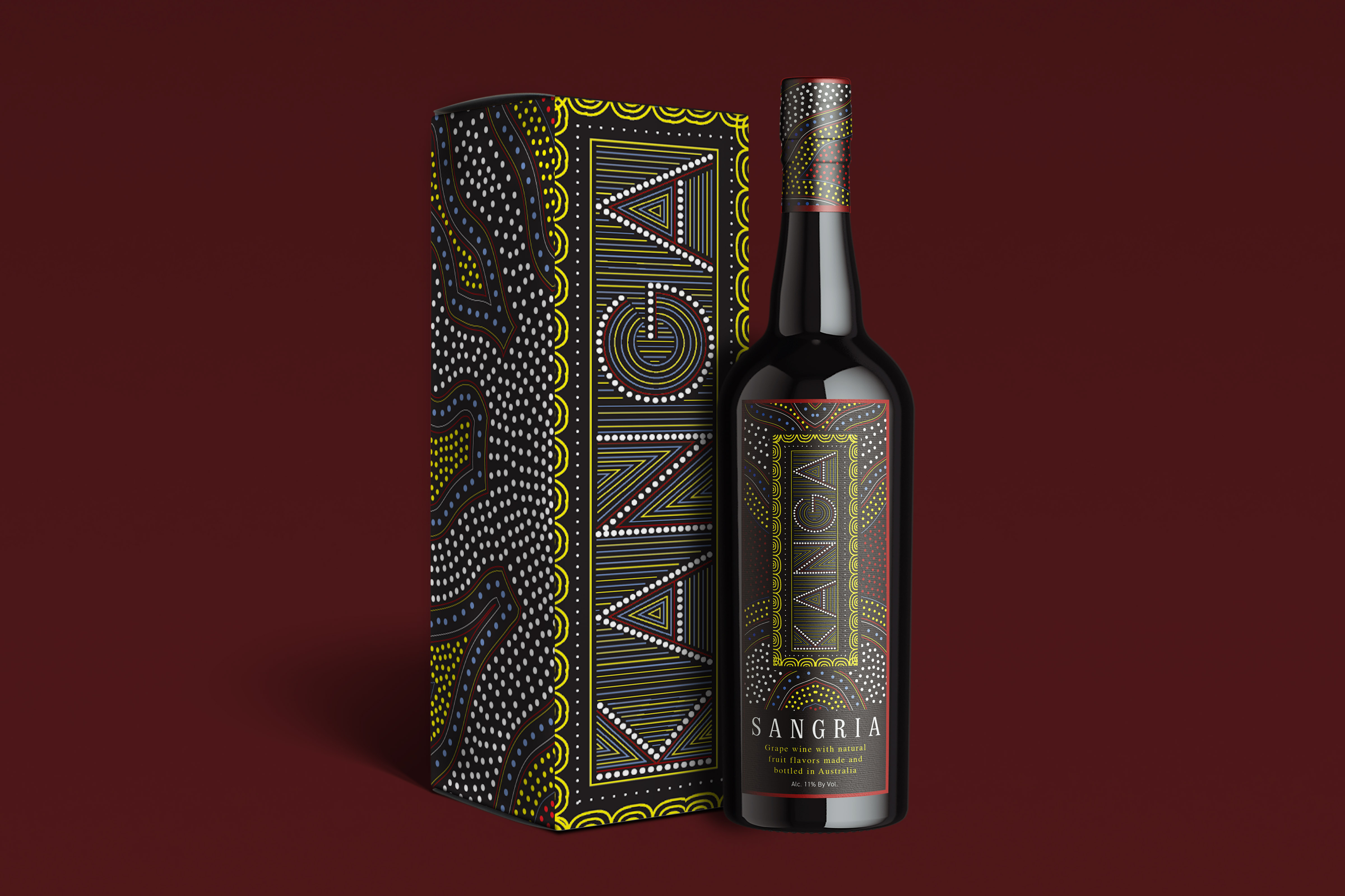
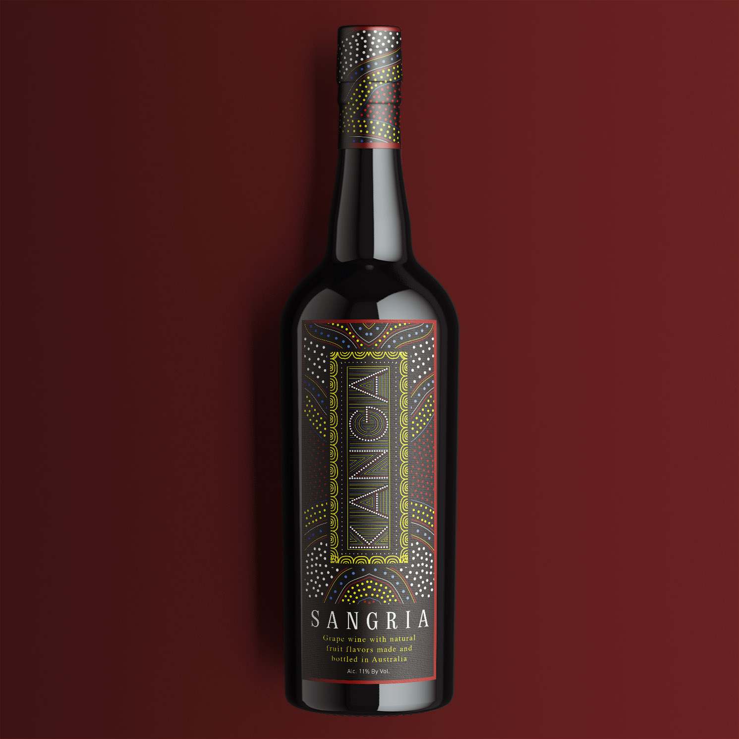
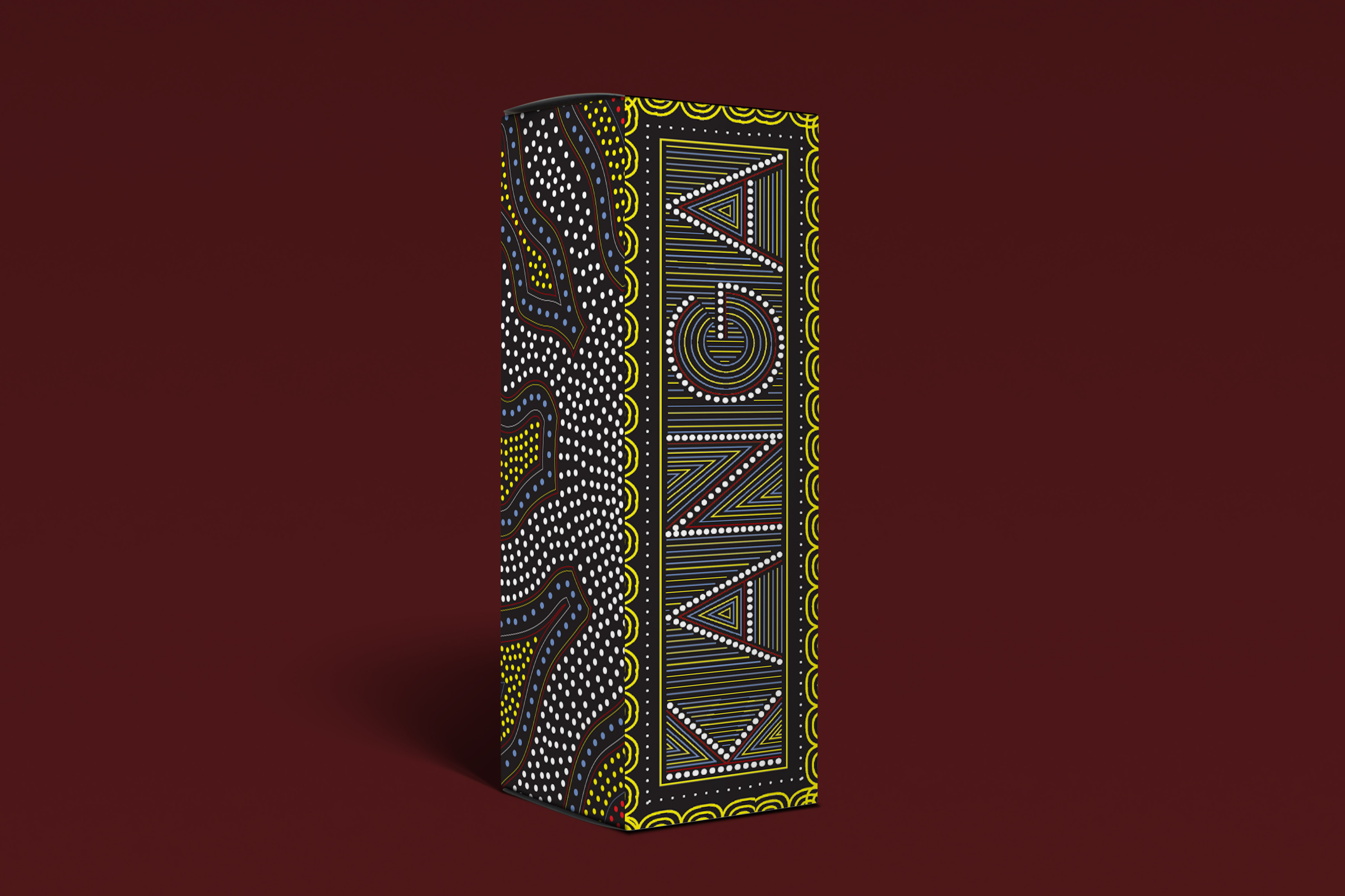
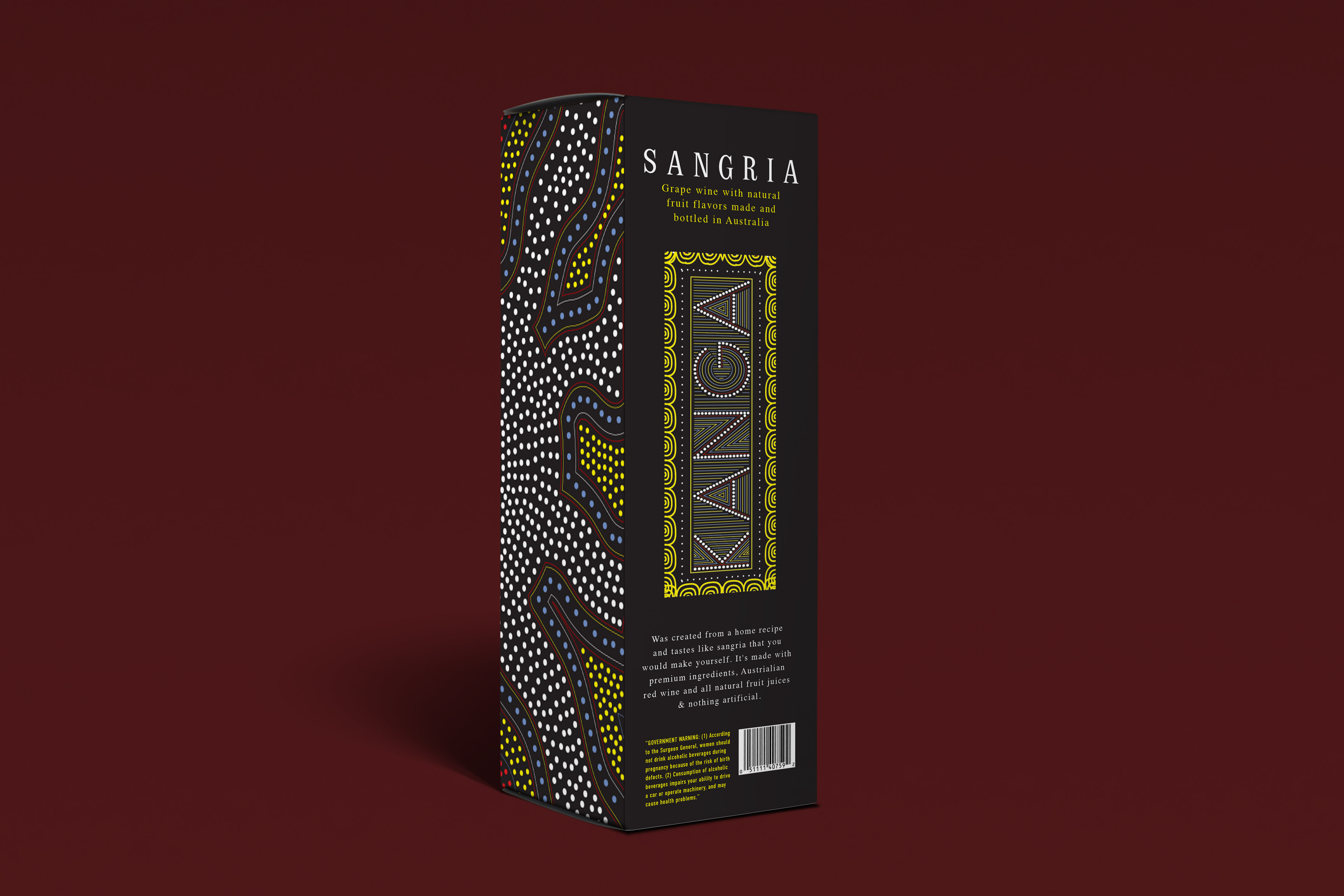
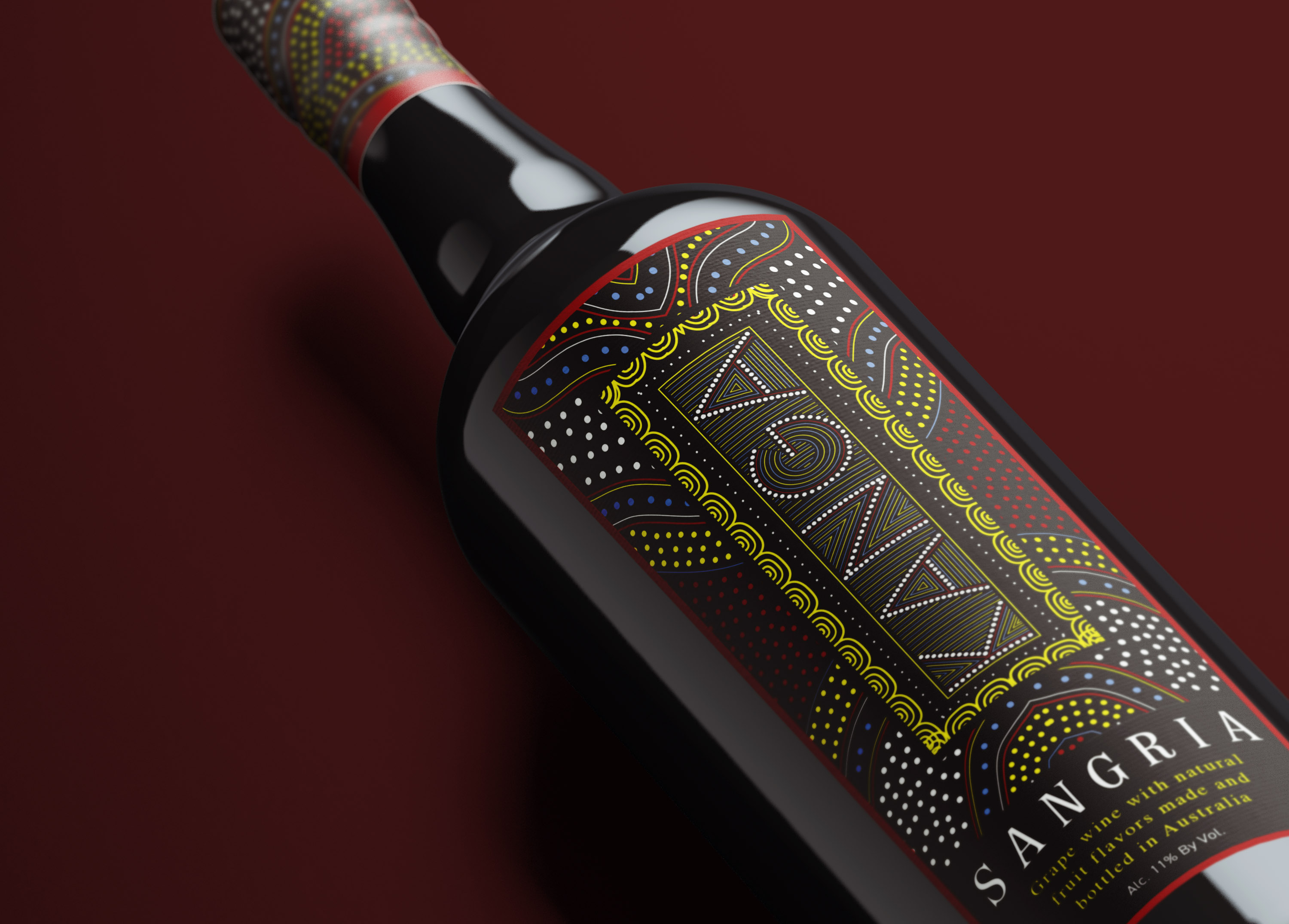
Kanga is Australia inspired wine brand. The eye-catching logo and label have elements that are based off of aboriginal artwork. Red, yellow, Blue, and white contrast against a black back ground to really make the patterns pop off the bottle. The box features more of these patterns on the sides along with a blown-up logo on the front making sure it stands out among other brands on a shelf.